Display ads of all colors and sizes are common ornaments of almost all web pages. In fact, odds are you’ve seen several display ads today while browsing the internet…but do you remember them?
If you are part of the overwhelming majority of the population and if the ads you recently viewed were comparable to most display ads, you likely don’t recall the companies or products that were showcased by the ad. In the digital marketing word, there’s a term for this condition and it’s called Banner blindness; a very well known and real trend. Of course, you want to make sure this doesn’t happen with your display advertisements. Read on to learn how to avoid Banner blinding your audience.
Assuming that your goal is to ensure web site visitors are able to see and click through your banners and display ads as opposed to instantly closing or ignoring them, below are the most beneficial steps you can take to turn web viewers into your customers.
1) KISS (Keep It Simple, Stupid)
Of course it may seem like the best way to get the most bang for your advertising buck is to spend the most dollars possible on your ads and put as much on there as you can. However, this isn’t the best plan as marketing data clearly demonstrates that small sized display ads can easily be cluttered with too much content that only serves to confuse the viewer and make the ad more challenging to read and absorb.
Don’t be this person:
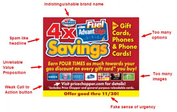 The key to remember here is to make sure your imagery, messages and Call-to- Actions are as straightforward as possible and easy to read and grasp quickly.
Although your ad may be minimal and not saying much in terms of quantity, a clean ad design with an effective amount of white space and a defined hierarchy and purpose is the most effective choice.
2) Select High Quality Ad Assets
Although you ad is likely small, don’t take this to mean that you should skimp on investing in quality ad components.
Instead, opt for high-quality illustrations or photographs, depending on your purposes. Use a site like Envanto to gain access to quality images for all your needs.
Go for clearly legible fonts and take special care to have logos that pop and are especially crisp.
Equally important to remember is that your ad should be designed to export at the highest quality it can while still falling within the 150 kb maximum file size for Google Ads. As a final quality tip, always double check your exported images before you upload them.
3) Make it Pop
Your ad should be distinctive enough to stand out to your visitor from the rest of the text and images on the webpage. This concept is not just about making your ad attractive, but rather it gives your ad a better chance of ad network approval.
Your border design is significant when it comes to helping your ad pop. Aim for clearly defined borders; you can do this most effectively by placing y. our images and colors on the edge of the ad. This is good practice in regards to ad compliance but also is a great strategy for drawing a visitors eye to your ad. Marketing analysis has proven that our eyes tend to gravitate towards words or images that are in boxes.
4) Relevance Is Key
Marketing goes well when your ad is relevant to the correct audience. That means timing, images, offers and text.
Keep your end user in mind. Keep their experience in mind. You want your ad to appear so seamless, so perfect, they are actually thanking you for showing them an add because it’s perfect for their situation.
5) Keep Branding Uniform
Two items come into play here. One, you always want to keep a similar feel or vibe to your ads. Soft colors vs. bright, fonts used, backgrounds. Now, you don’t want and/or need all your ads to be exactly the same, but you want people to be able to recognize it’s your brand without seeing your logo. They instinctively know it’s you.
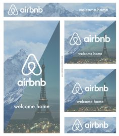
Airbnb does a great job at this. The red and green set has the same offer, but slightly different, giving the user a different experience every time they see an Airbnb ad.
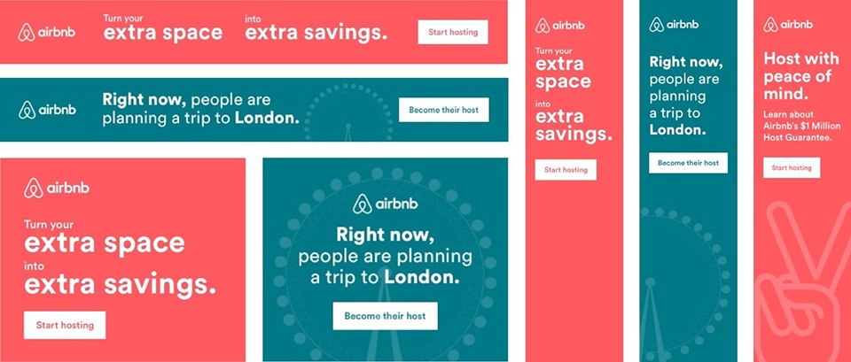
And we can even compare a completely different offer, this one used to bring in new guest rather than host. The branding is similar. For Airbnb, that’s simplistic with their logal being very clear. No matter what, when you see either of these ads, you know it’s Airbnb.
 This is critical as our eyes tend to glance over ads after we see them too many times. If the user continues to see similar branding, even if they are only glancing by it to something more important at that given second, you’re priming their mind to recall your brand when the time is right.
And two, you also want the ad to have a similar feel to the landing page your user will land on. Nothing is worse than clicking on an ad and going to landing page with completely different colors, products or overall feel. It’s not what the user was expecting and they will leave immediately.
Summary
Now you’re ready to create your ads, get them in front of the right audience and grow your message.
Keep your message simply, think about the user experience and give them something they should thank you for.
Any tips to add based on your experience?